Reimagining Mobile Banking with GenAI
As part of a 20-week capstone with KeyBank, I explored how generative AI can meet users where they are, offering real-time budgeting tools, transaction insights, and financial literacy support directly within their mobile app experience.
UX Designer, Researcher, Product Strategist
January – June 2025
4 designers
KeyBank
Challenge
KeyBank wanted to explore how generative AI could enhance the mobile banking experience, beyond basic chatbots, while maintaining user trust, clarity, and control.
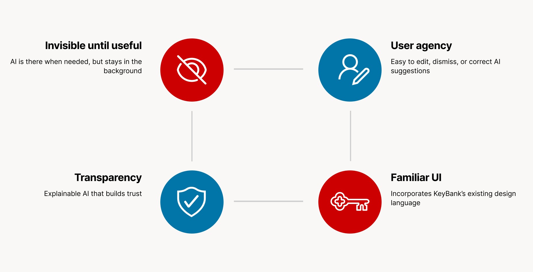
The challenge: design an AI-enhanced experience that builds trust, feels intuitive, and empowers users to make smarter money choices.
Solution
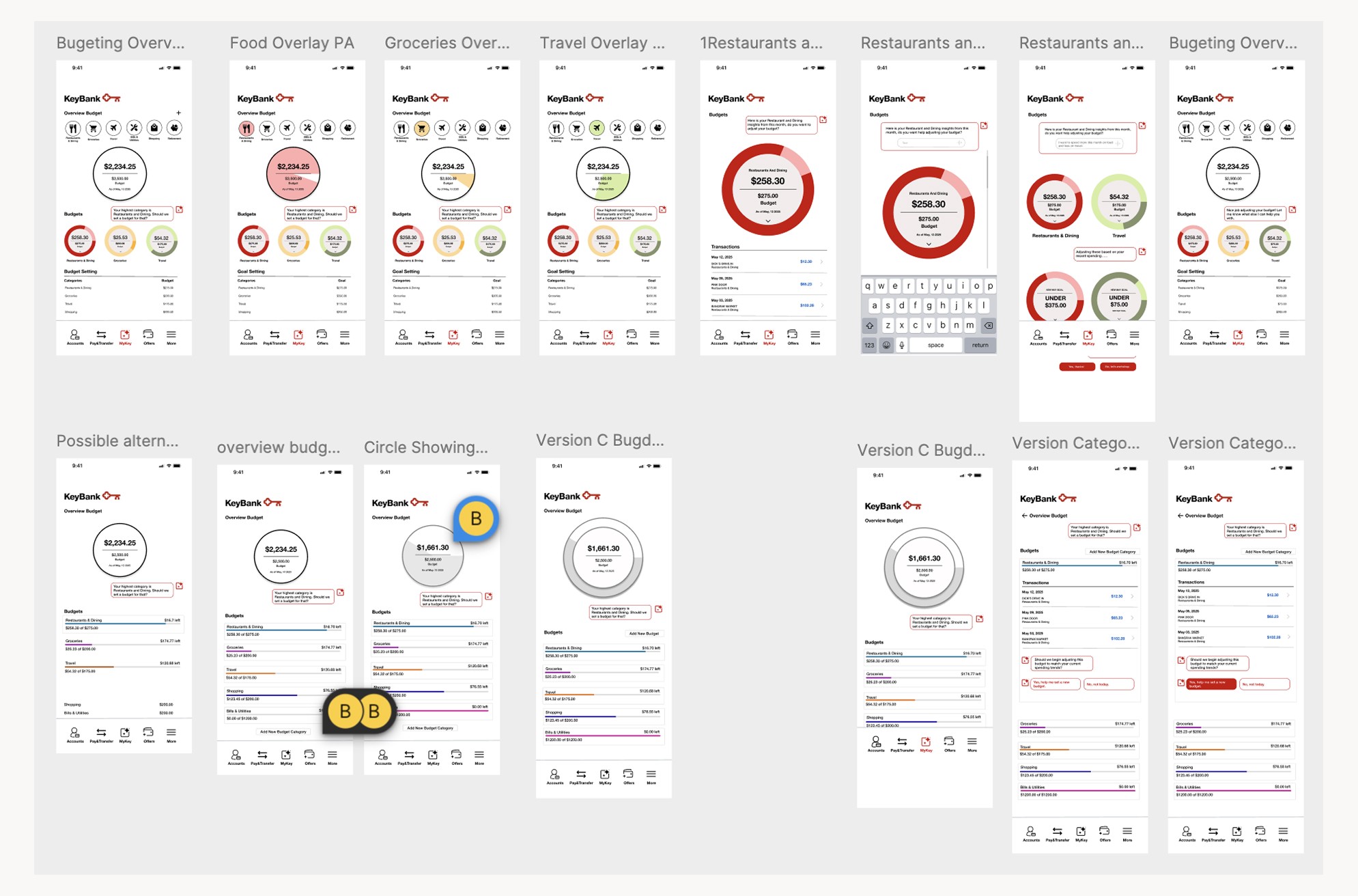
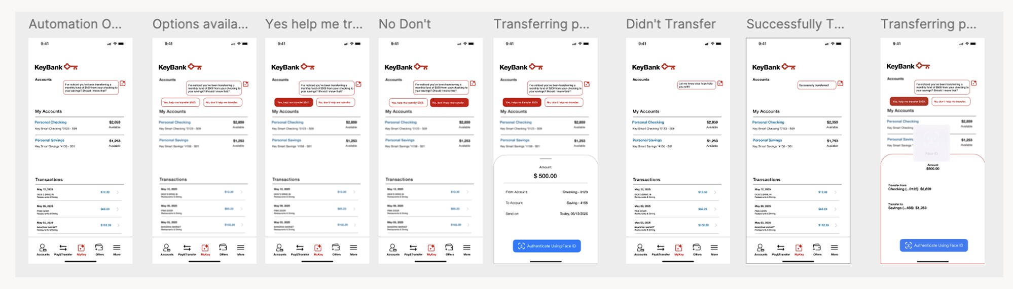
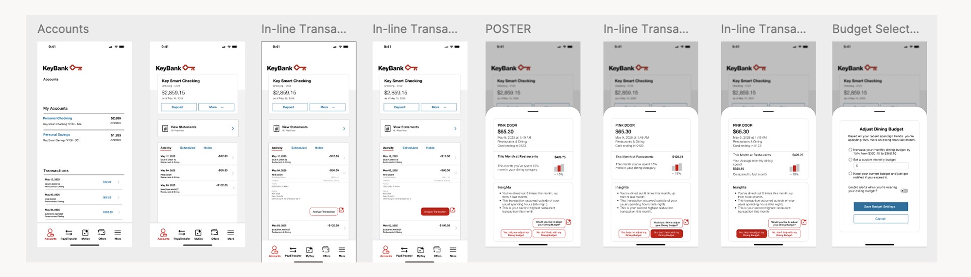
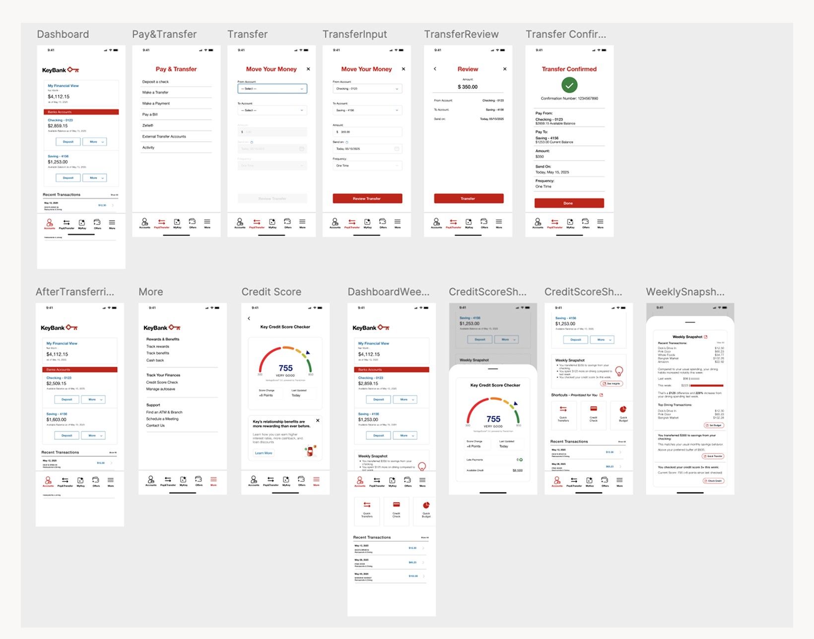
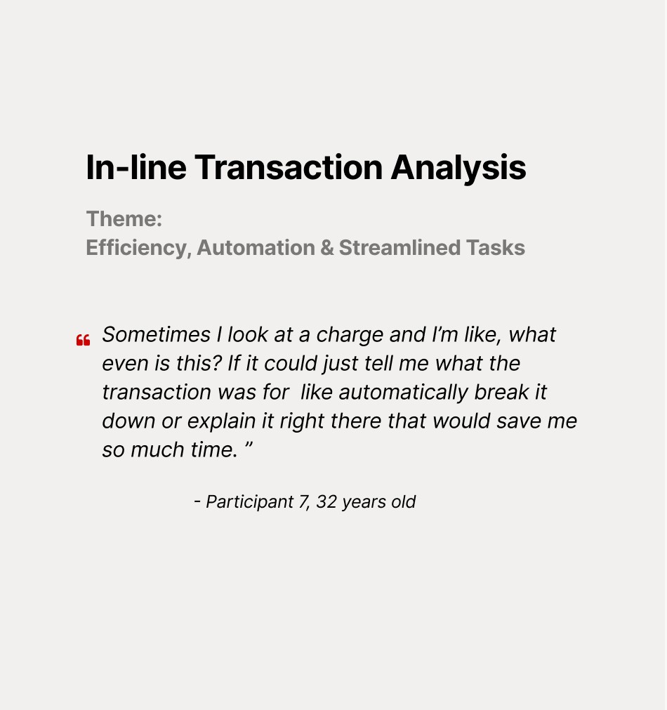
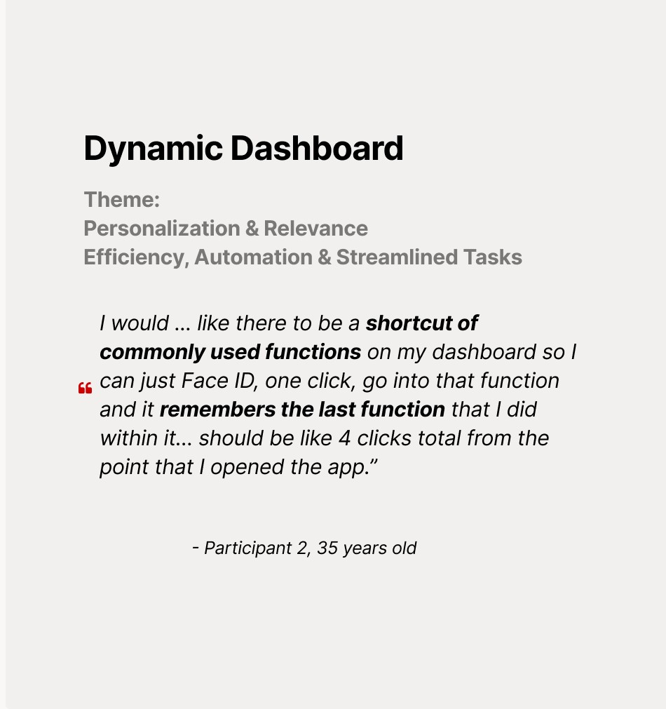
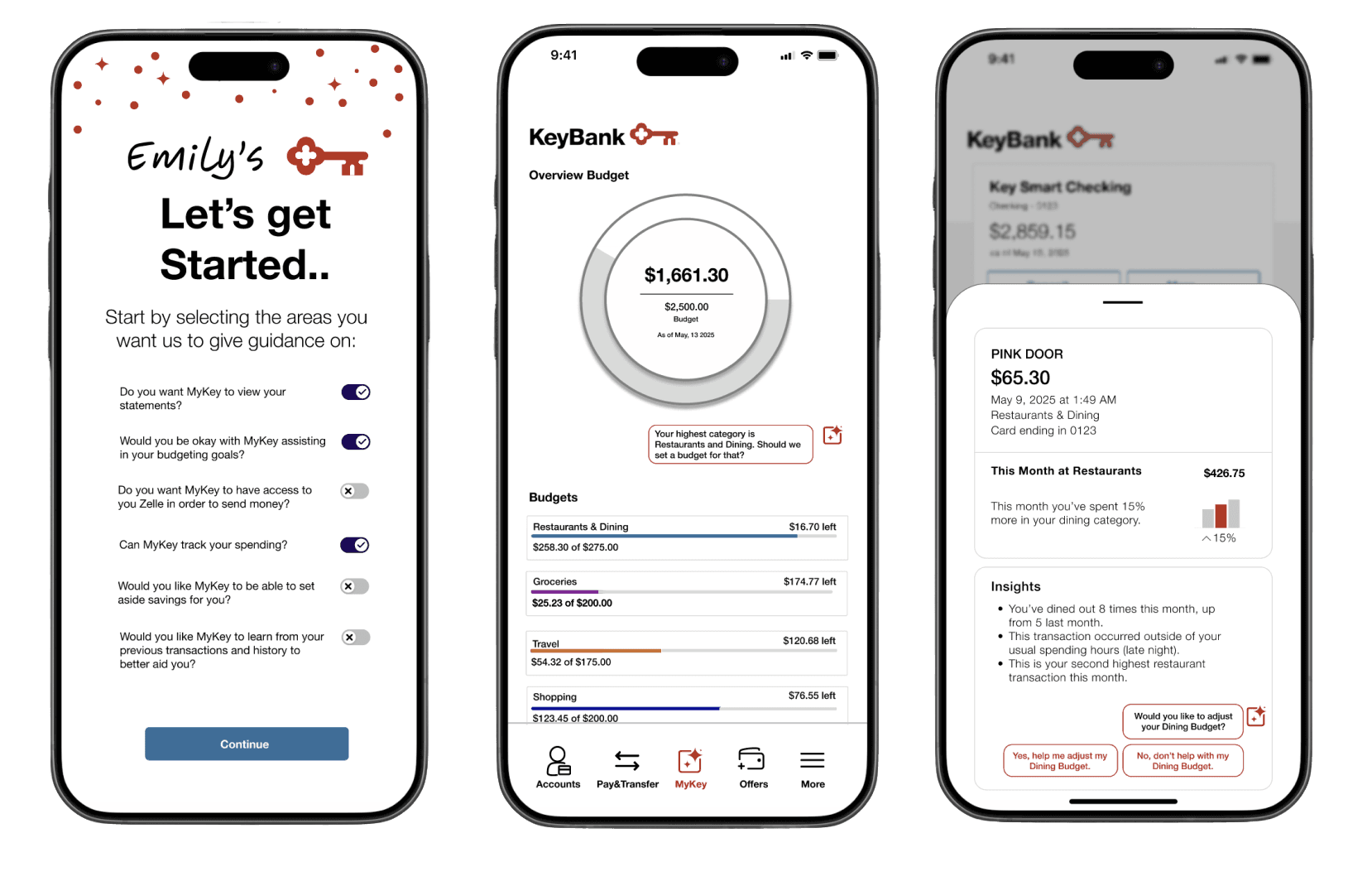
We focused on in-line GenAI, AI that surfaces relevant insights (like budget nudges or savings updates) directly within the user’s flow, making it helpful but never intrusive.
Process
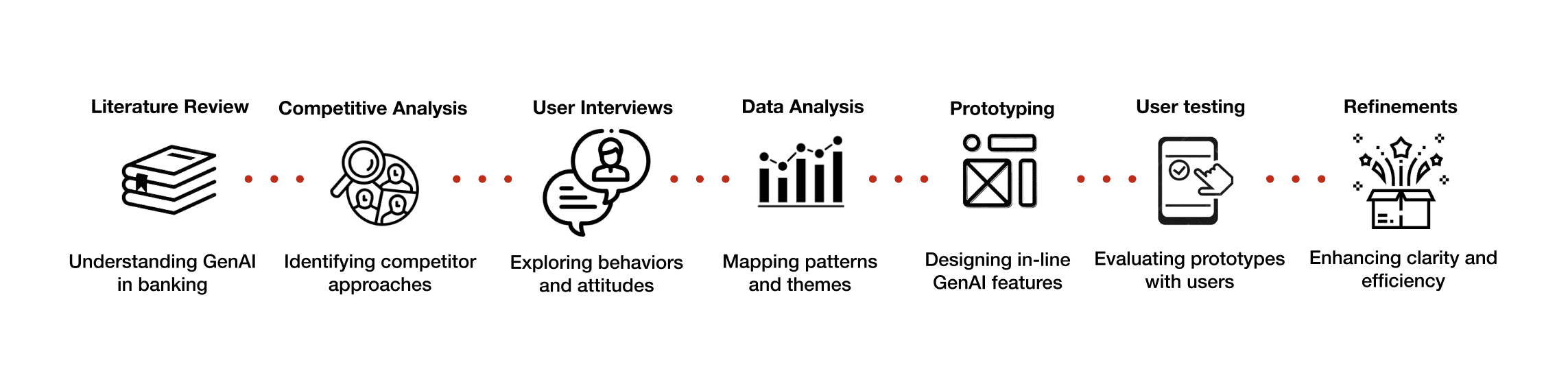
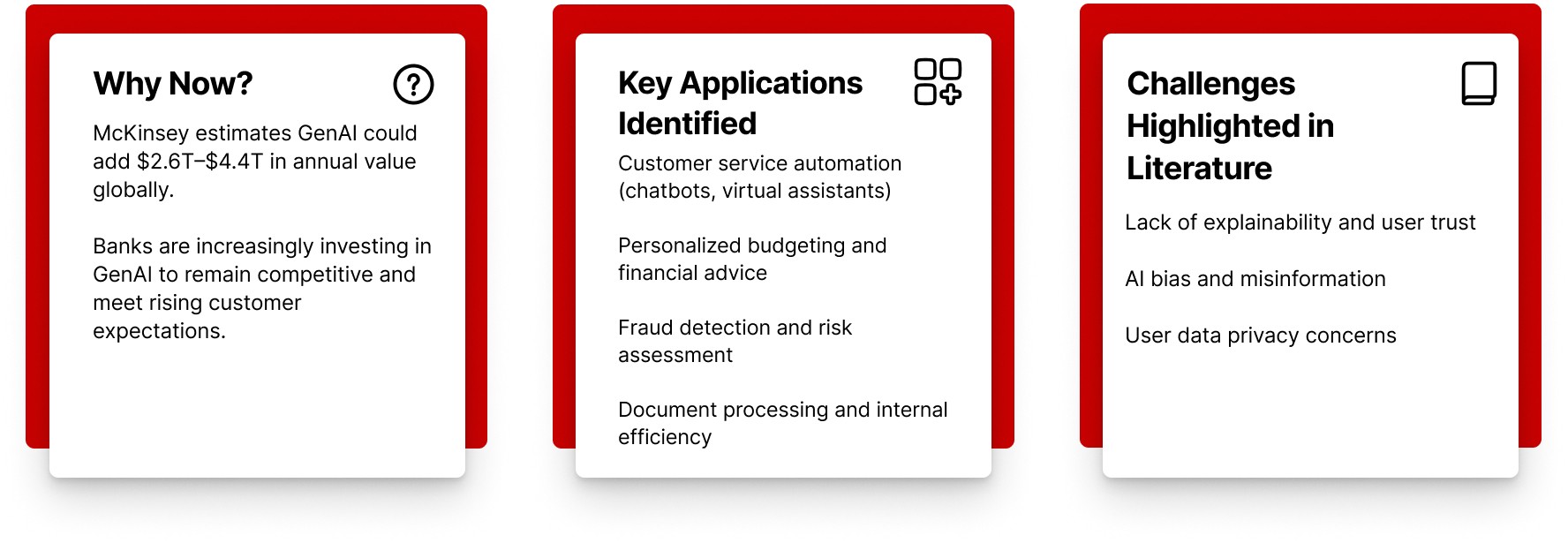
Literature Review: We began by reviewing academic and industry sources to understand how generative AI is currently being explored in banking, with a focus on trust, usability, and transparency.
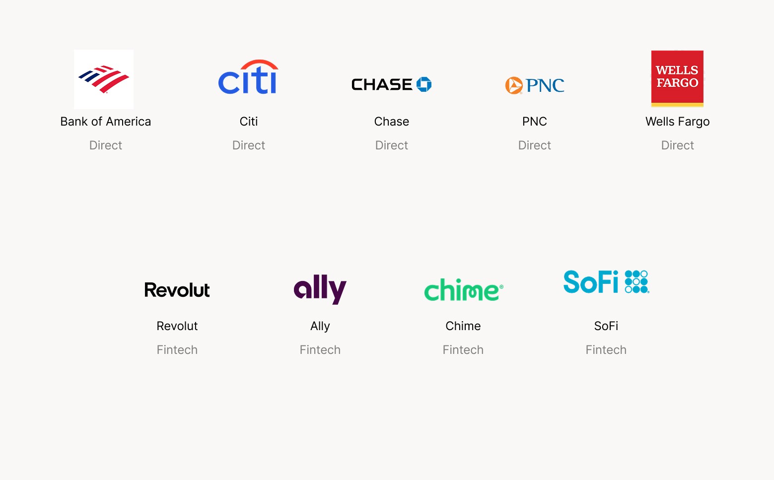
Competitive Analysis: We evaluated mobile banking apps from key competitors to identify common AI features, gaps in user experience, and best practices for integration.
User Interviews: We conducted interviews to explore users’ behaviors, needs, and concerns around AI in banking. We focused on their comfort levels, trust factors, and pain points with current tools.
Data Analysis: We synthesized findings from 22 survey responses and our interviews, mapping out recurring patterns, emotional responses, and feature preferences.
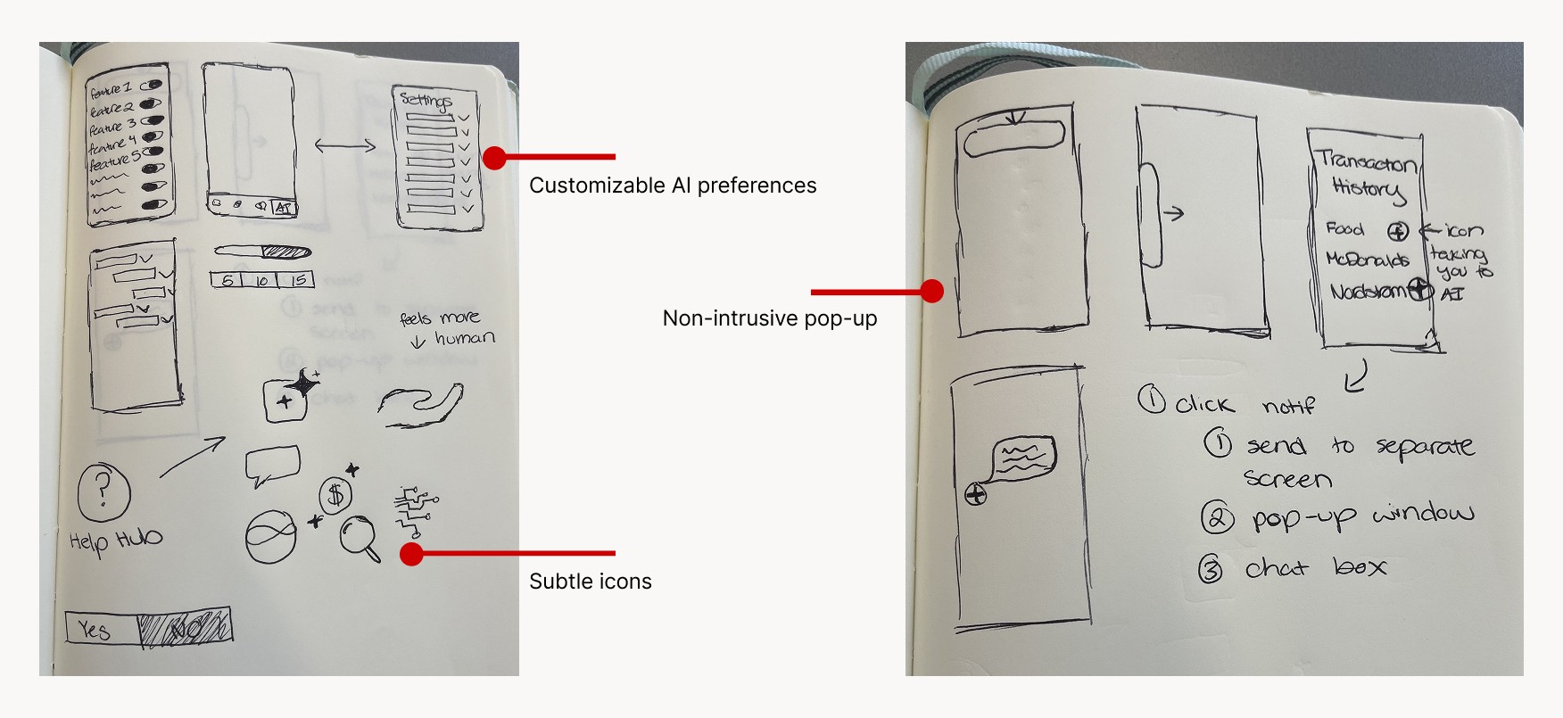
Prototyping: Our team translated insights into low-fidelity sketches and mid-fidelity wireframes. We focused on designing contextual GenAI touchpoints that aligned with user mental models.
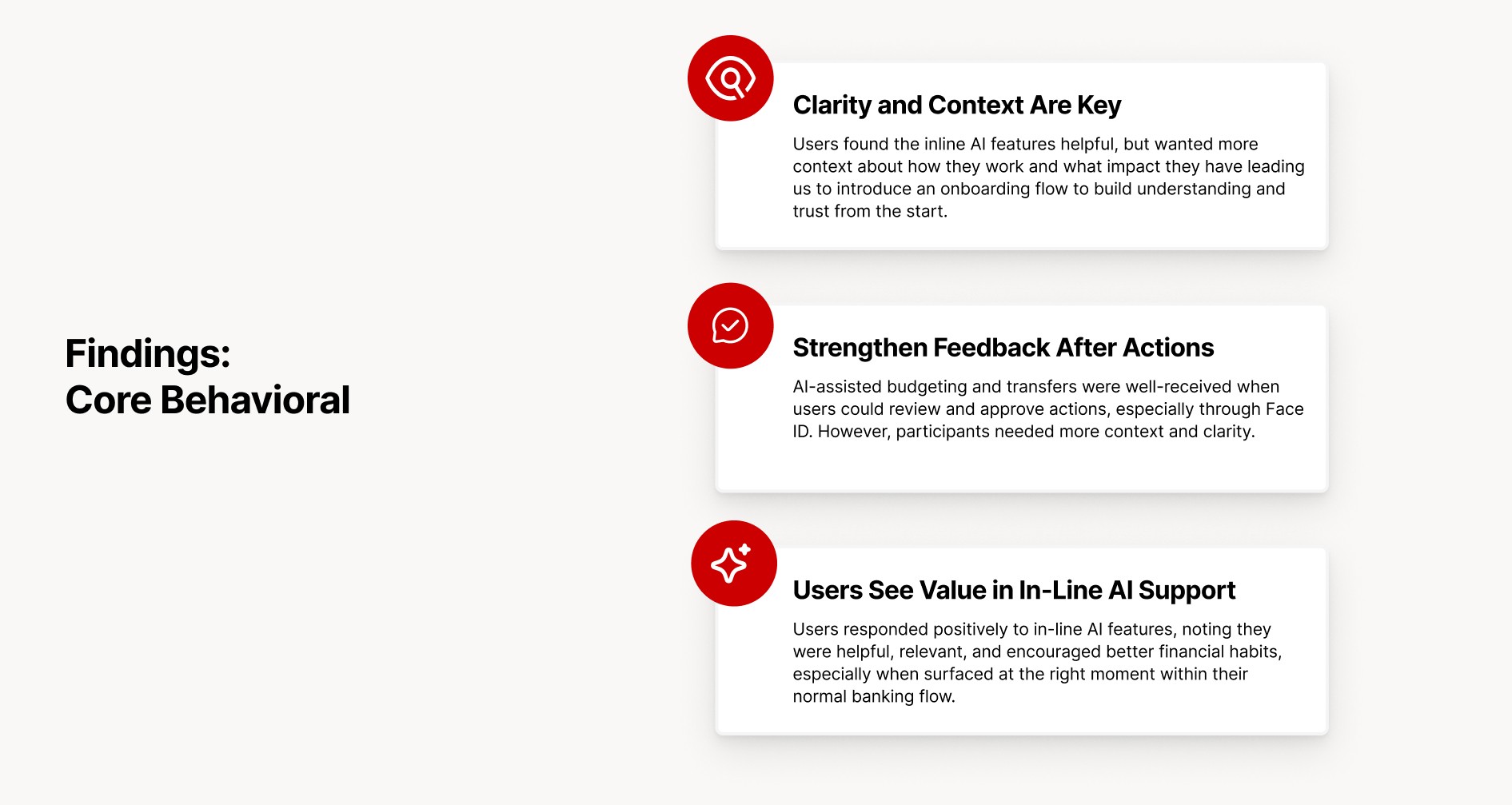
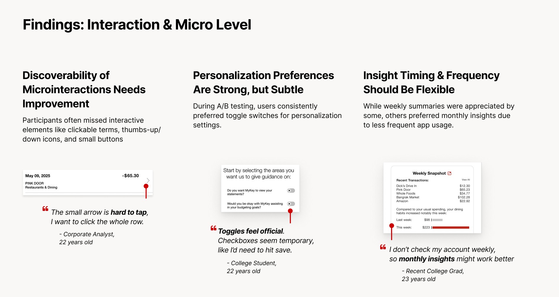
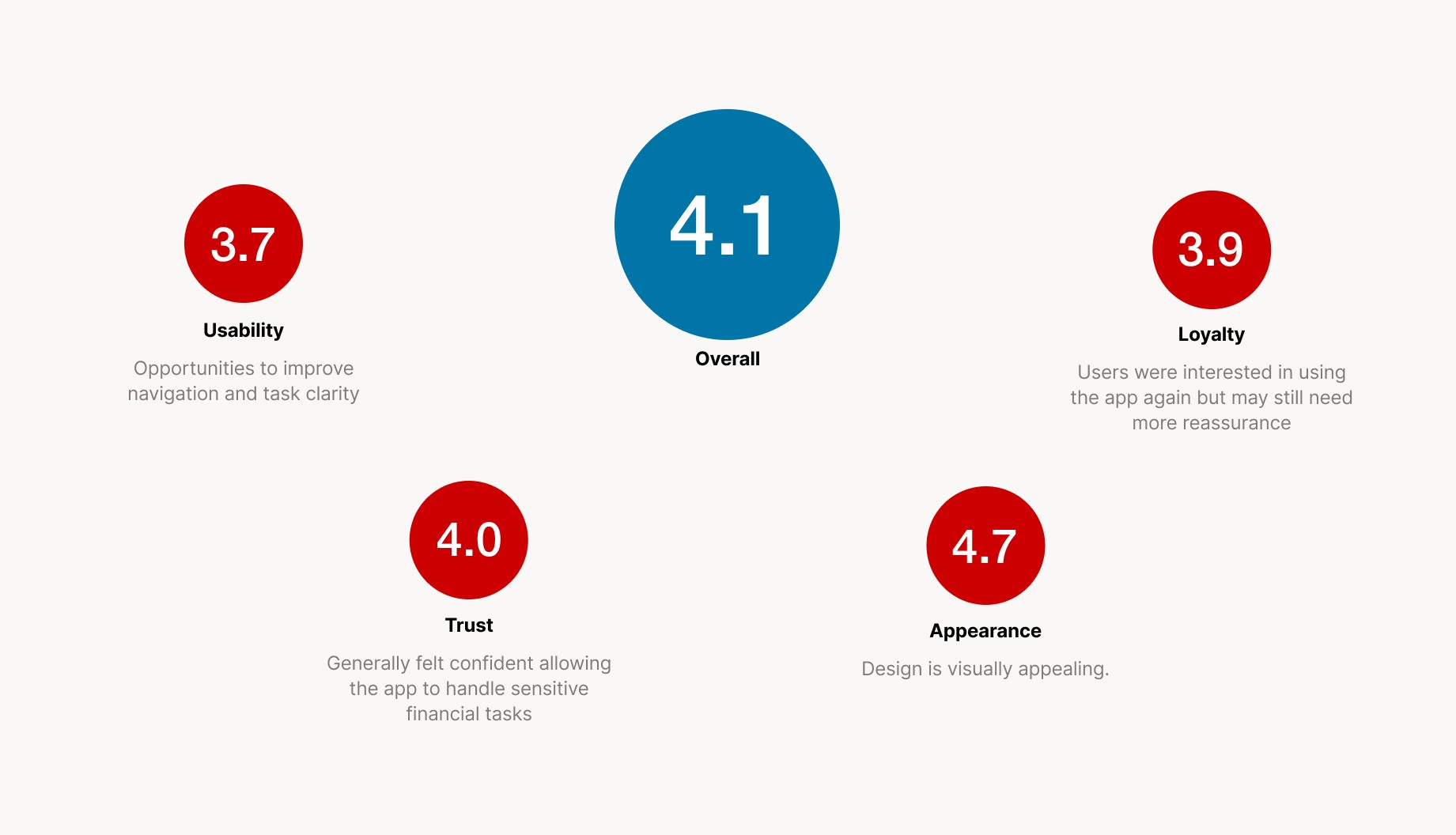
User Testing: We tested our interactive prototype with a diverse group of users, capturing feedback on tone, clarity, and usability. This helped us validate and refine our designs.
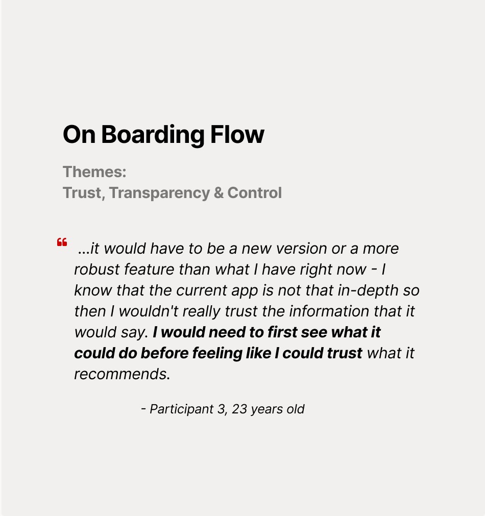
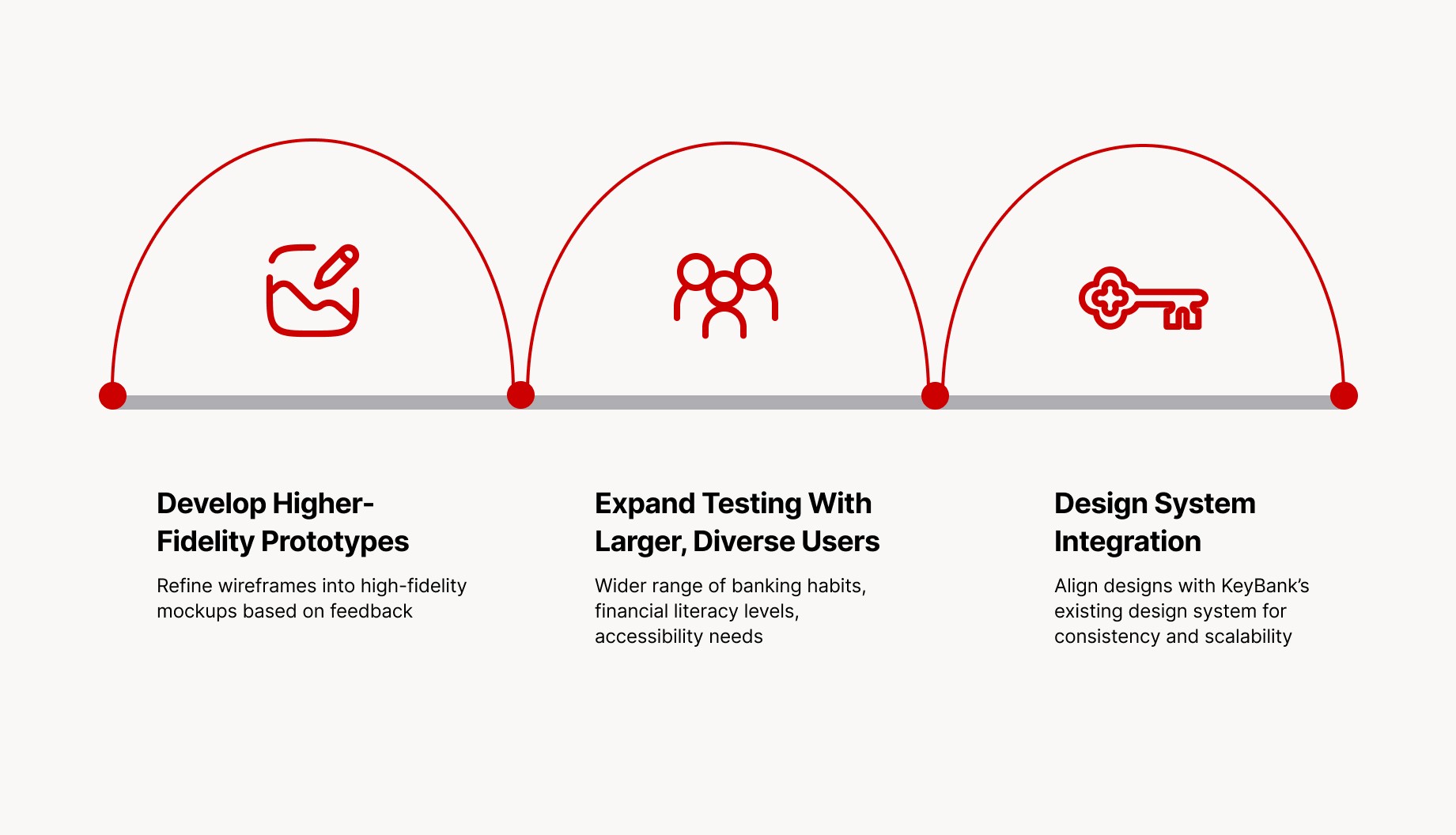
Refinements: Based on testing and stakeholder input, we improved the onboarding flow, clarified insight language, and simplified interaction paths to enhance trust and efficiency.
Compatitive Analysis
Miro Board of Competitive Analysis
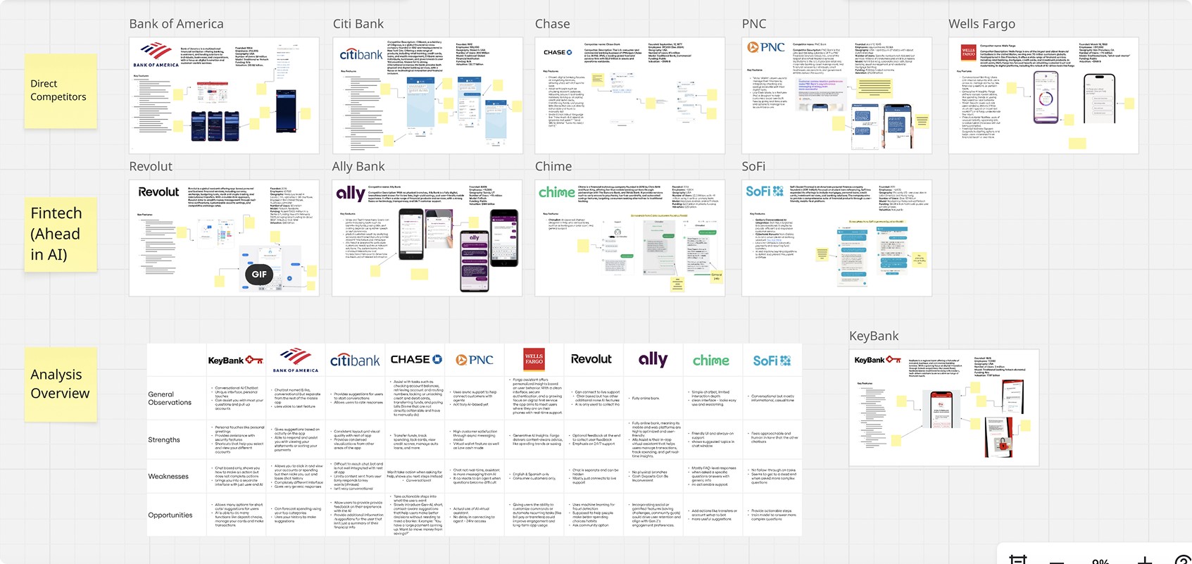
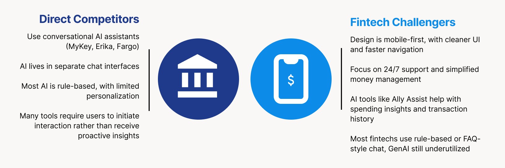
What We Learned From These Companies
Everyday In-Line GenAI Examples
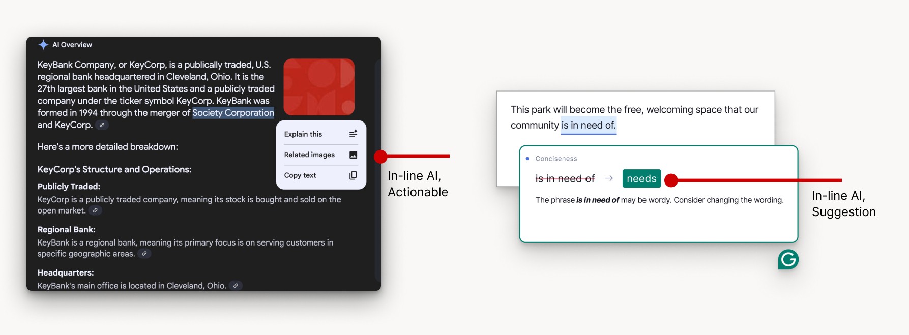
Here are some examples of in-line Ai that you've probably seen before.
On the left, we see an example of actionable in-line AI from the google search AI. Here, AI is embedded directly within the content, allowing users to take immediate actions like explaining a concept, finding related images, or copying text - without leaving their current workflow.
On the right, we have an example of in-line AI suggestions. In this case, the AI Grammarly uses provides real-time writing feedback, such as recommending more concise phrasing.
User Research
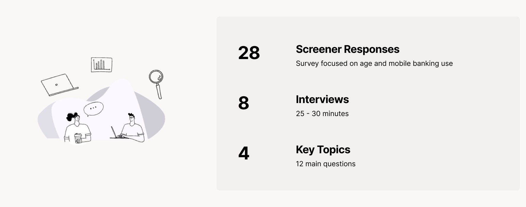
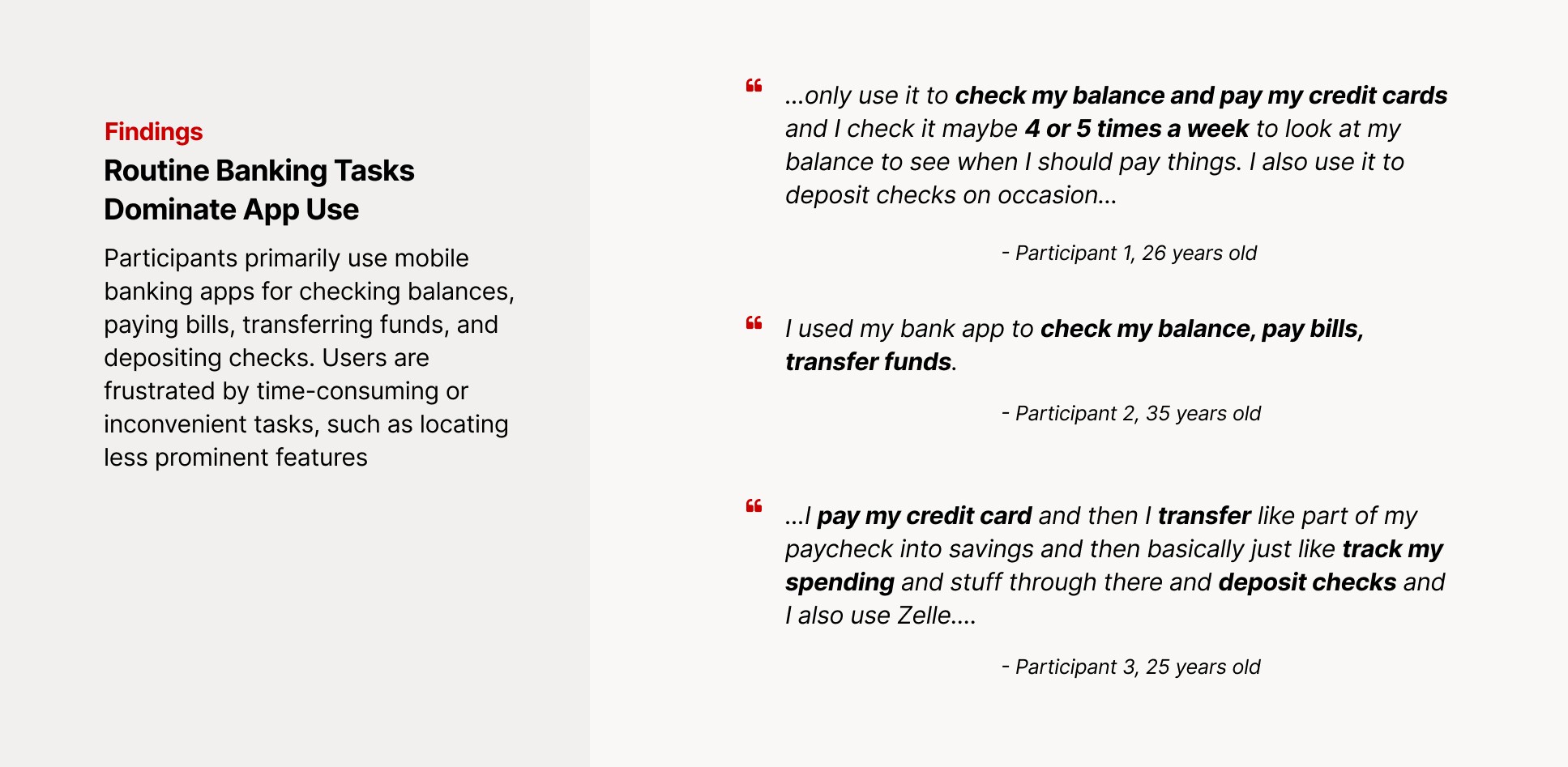
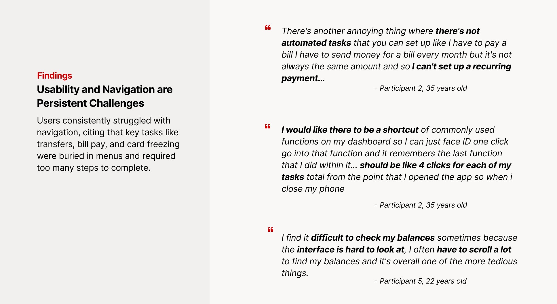
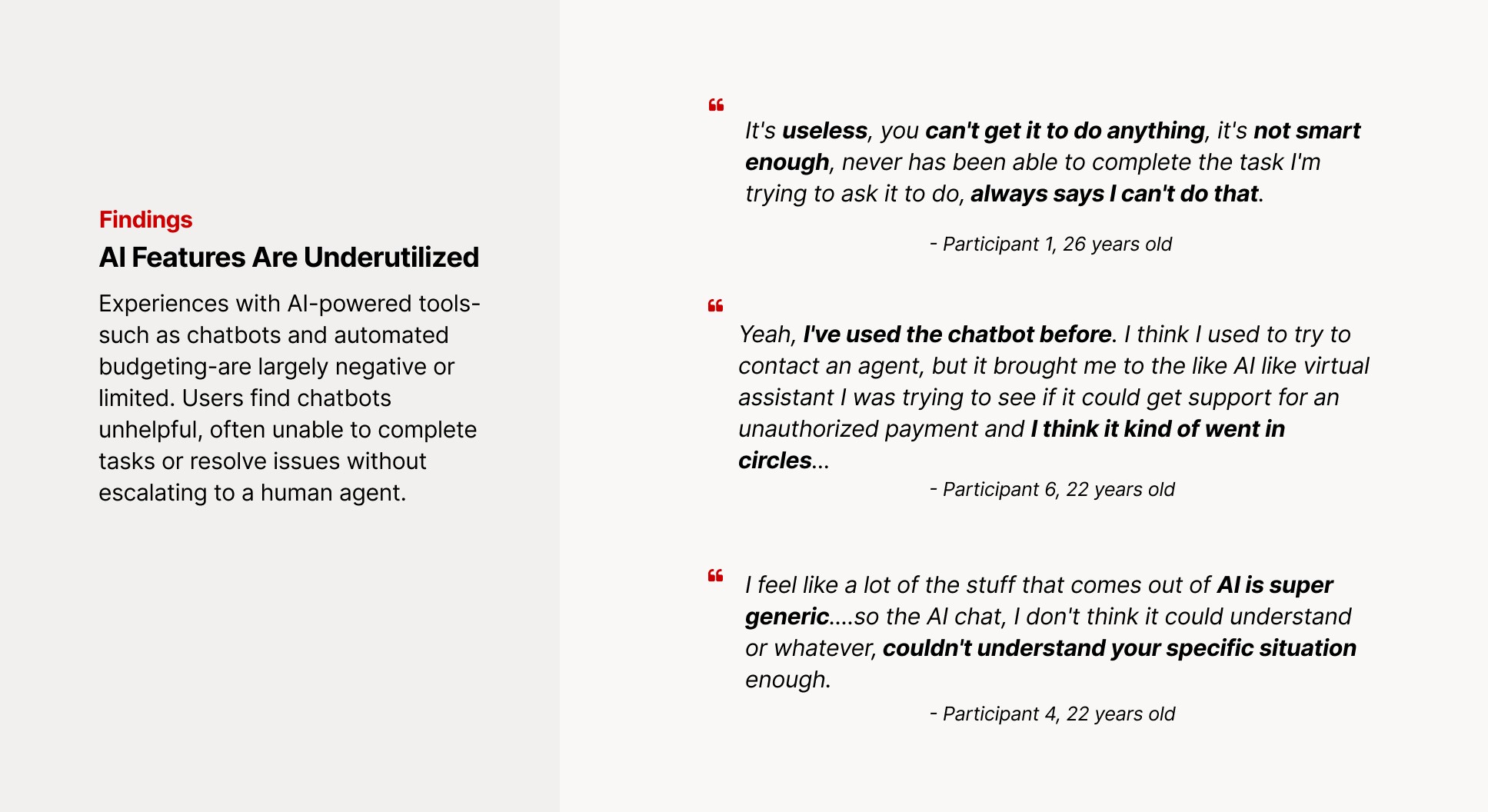
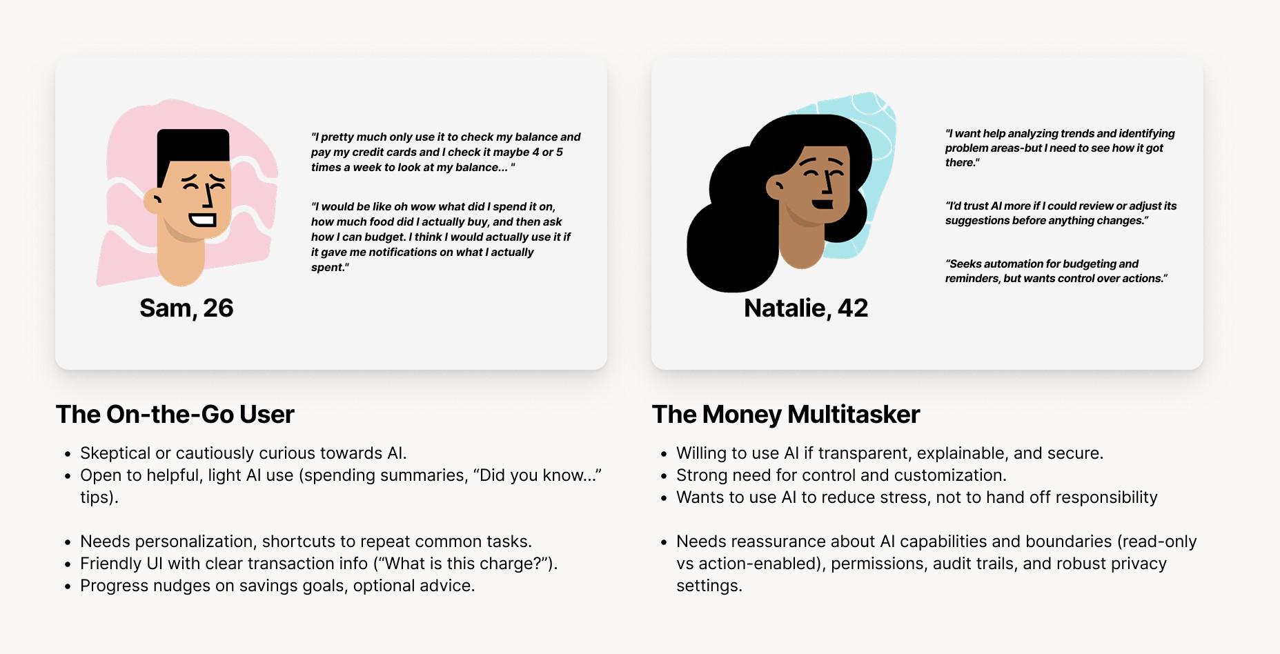
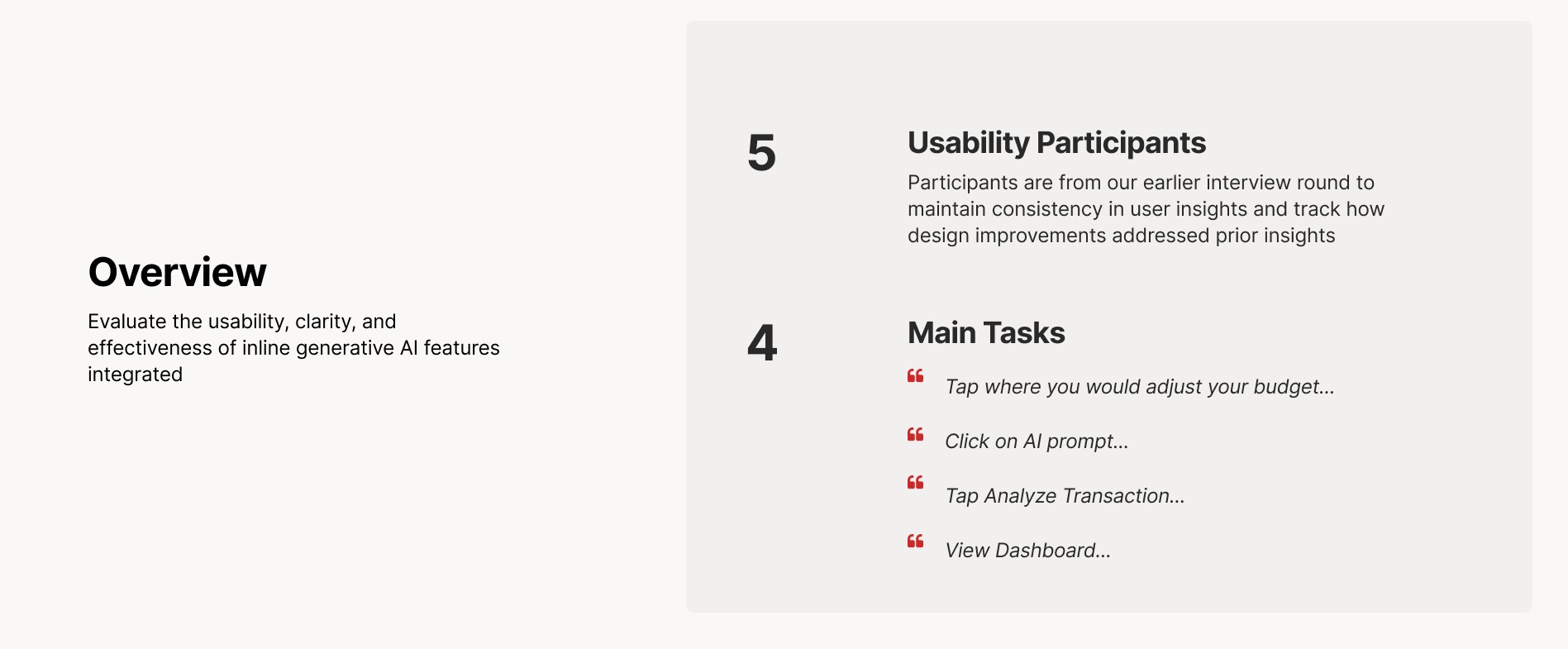
After our competitive analysis we did a round of interviews. We began our user research by sending out a screening survey to gather information on user's mobile banking habits, comfort with AI, and prior experience with digital banking tools. This helped us identify a range of users who actively manage their finances through mobile apps.
From that pool, we selected eight participants to take part in semi-structured interviews. Each interview lasted around 25 to 30 minutes and was conducted over Zoom or in person. We specifically included participants who were 18 and older, used mobile banking at least occasionally, and had varying levels of familiarity with AI features in apps.
The interviews focused on four key areas and included 12 main questions designed to explore user behaviors, attitudes toward AI, and expectations for financial features.
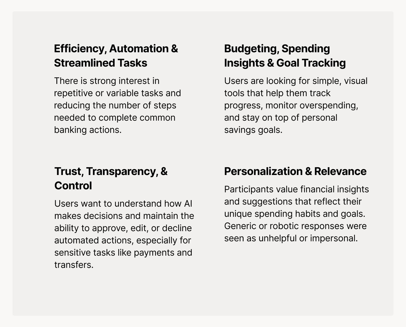
What We Wanted to Learn
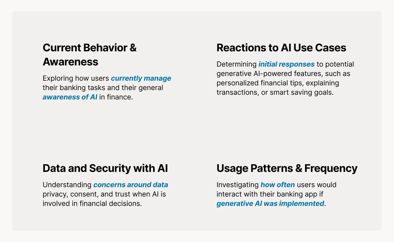
Before going into the interviews, we identified four key areas we wanted to learn more about from participants.
First, we explored Current Behavior & Awareness — how people currently use their mobile banking apps, what they do most often, and whether they’re aware that AI is already part of some financial tools.
Second, we asked about Reactions to AI Use Cases, like personalized savings goals or transaction explanations. We wanted to see which types of features felt helpful and which ones felt unnecessary or even uncomfortable.
We also asked about Data and Security with AI, because concerns around privacy and trust came up earlier in our background research. We asked participants how they’d feel about AI seeing their transaction history, and what types of controls they’d want in place.
Finally, we asked about Usage Patterns & Frequency with questions about how often they thought they’d actually interact with AI features if they were part of their banking app. That helped us understand where to design for regular use versus more occasional, on-demand support.